Chromatic Harmonies: Integrating Color Theory into Diorama Design
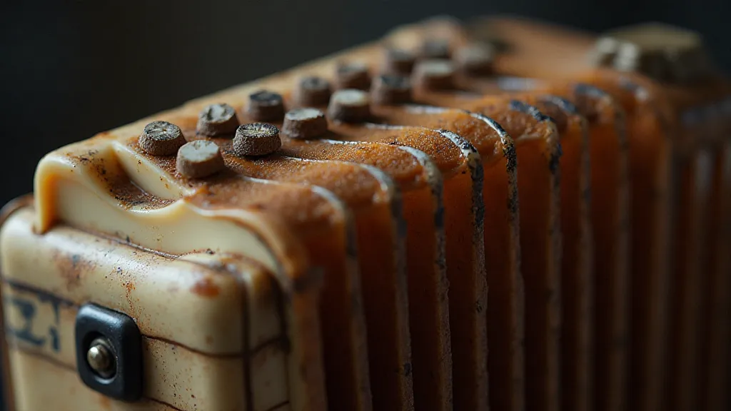
There’s a certain magic in old things. Not just in their age, but in the echoes of creation they hold. I’m thinking of a treasured antique accordion I inherited from my grandfather. It's a Hohner Monarch, a beautiful instrument crafted in the 1930s, its bellows a rich, almost smoky brown, the keys a creamy ivory, the metal trim a subtly tarnished gold. Each component, selected and assembled with precision, contributes to a unified whole – a chromatic harmony of color and form that speaks of a bygone era. That same principle, that deep understanding of how colors interact and affect the viewer, is crucial to crafting compelling miniature railway dioramas. It goes far beyond simply choosing ‘realistic’ colors; it’s about intentionally manipulating the viewer’s emotional response through the thoughtful application of color theory.
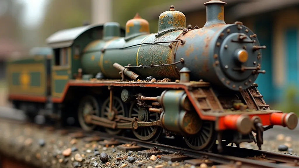
Most beginners in model railroading focus on accuracy – the right shade of green for a Southern Pacific locomotive, the correct brick color for a factory building. While accuracy certainly has its place, it’s only a starting point. Think of those early Hollywood films, striving for technical realism. They were technically impressive but often lacked the emotional resonance that comes from deliberate artistic choices. That’s where color theory comes in. It provides the framework for those choices.
Understanding the Basics: Hue, Value, and Saturation
Before we dive into more advanced concepts, let's establish a firm foundation. The core components of color are hue (the pure color itself – red, blue, green), value (how light or dark a color appears), and saturation (the intensity or purity of a color – think vibrant red versus a muddy, desaturated red). Mastering these three allows you to manipulate how colors perceive and influence a scene.
Consider the classic example of a snowy mountain scene. A purely realistic approach might involve a very light gray for the snow. However, a slightly warmer value – a very pale cream – can evoke a feeling of warmth and tranquility, suggesting sunlight filtering through the clouds. Conversely, a cooler, more desaturated value can convey a feeling of biting cold and isolation.
Color Schemes: Recipes for Visual Coherence
Color schemes provide structured guidelines for combining colors effectively. The most common include:
- Monochromatic: Uses variations of a single hue. Can be calming and sophisticated, but risks being monotonous if not handled carefully. Subtle shifts in value and saturation are crucial.
- Analogous: Combines colors that are adjacent to each other on the color wheel (e.g., blue, blue-green, green). Creates a harmonious and pleasing effect.
- Complementary: Uses colors opposite each other on the color wheel (e.g., red and green, blue and orange). Provides strong contrast and visual excitement. Use sparingly; too much can be jarring.
- Triadic: Uses three colors evenly spaced on the color wheel. Offers a balanced and vibrant palette.
- Split-Complementary: Uses a base color and the two colors adjacent to its complement. A more nuanced version of complementary schemes, offering more flexibility.
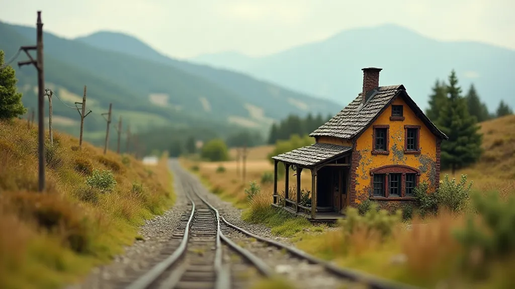
Think about the Pennsylvania Railroad’s iconic Tuscan Red. It’s a warm, inviting color. In a diorama, it can be dramatically offset by a cool, desaturated green for the surrounding foliage. This isn't just about "looking right"; it's about creating a specific *feeling*.
Atmospheric Perspective and Aerial Perspective
One of the most powerful tools in a diorama artist’s arsenal is understanding atmospheric perspective, also known as aerial perspective. This technique simulates the effect of distance by gradually reducing the saturation and increasing the value of objects as they recede into the background. Distant mountains aren’t vibrant blues and greens; they’re muted grays and pale blues, softened by the intervening atmosphere.
My grandfather, a skilled woodworker, would often explain how he used glazes – thin, transparent layers of paint – to soften the edges of his projects and create a sense of depth. The same principle applies to diorama design. A faint wash of gray or brown over distant hills can instantly increase the perceived distance and create a more realistic effect.
The Psychology of Color: Evoking Emotion
Color isn’t just about aesthetics; it’s deeply connected to our emotions and psychological responses. Red is often associated with excitement, danger, and passion. Blue evokes feelings of calmness, tranquility, and trust. Green symbolizes nature, growth, and harmony. Yellow represents happiness, optimism, and energy.
Consider a diorama depicting a busy industrial yard. The harsh, metallic tones of the locomotives and buildings could be amplified by the strategic use of oranges and yellows – colors that convey energy and activity. Conversely, a tranquil rural scene could benefit from a palette dominated by blues and greens – colors that evoke peace and serenity.
Think about the restoration of antique accordions. The choice of polish isn't purely about shine; it's about preserving the aged patina, the subtle changes in color that tell a story. A skilled restorer understands that a bright, new polish can erase the character of the instrument, while a careful application of a slightly aged polish can enhance its beauty.
Beyond Realism: Expressive Color Choices
While striving for realism is important, don't be afraid to break the rules. Expressive color choices can be incredibly effective in creating a unique and memorable diorama. Think of the Impressionist painters, who used vibrant, unrealistic colors to convey their emotional response to a scene.
Perhaps you want to depict a scene shrouded in a perpetual twilight, using muted blues and purples to create a sense of mystery and foreboding. Or maybe you want to portray a scene bathed in the warm glow of a setting sun, using oranges and yellows to create a feeling of nostalgia and romance. The possibilities are endless.
Final Thoughts: The Art of Seeing
Mastering color theory isn’t about memorizing formulas or applying rigid rules. It’s about developing your eye, your ability to *see* how colors interact and affect the viewer. It’s about understanding that color isn't just about representation; it’s about expression. Like the gentle hum of an antique accordion, a well-crafted diorama speaks to the heart, evoking a sense of wonder and transporting us to another time and place. The key is to listen to that inner voice, to experiment, and to embrace the endless possibilities of chromatic harmony.